Pmw.RadioSelect

Name

Pmw.RadioSelect() - a set of buttons, some of which may be selected

Inherits

Pmw.MegaWidget

Description

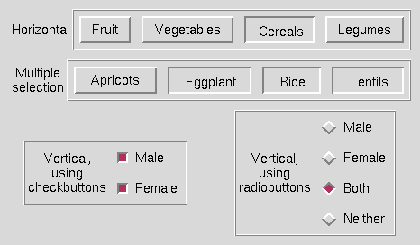
This class creates a manager widget for containing buttons. The buttons may be laid out either horizontally or vertically. In single selection mode, only one button may be selected at any one time. In multiple selection mode, several buttons may be selected at the same time and clicking on a selected button will deselect it.

The buttons displayed can be either standard buttons, radio buttons or check buttons. When selected, standard buttons are displayed sunken and radio and check buttons are displayed with the appropriate indicator color and relief.

Options

Options for this megawidget and its base classes are described below.

buttontype
Initialisation option. Specifies the default type of buttons created by the add() method. If 'button', the default type is Tkinter.Button. If 'radiobutton', the default type is Tkinter.Radiobutton. If 'checkbutton', the default type is Tkinter.Checkbutton.

If 'radiobutton', single selection mode is automatically set. If 'checkbutton', multiple selection mode is automatically set. The default is 'button'.

command
Specifies a function to call when one of the buttons is clicked on or when invoke() is called.

In single selection mode, the function is called with a single argument, which is the name of the selected button.

In multiple selection mode, the function is called with the first argument being the name of the button and the second argument being true if the button is now selected or false if it is now deselected. The default is None.

labelmargin
Initialisation option. If the labelpos option is not None, this specifies the distance between the label component and the rest of the megawidget. The default is 0.

labelpos
Initialisation option. Specifies where to place the label component. If not None, it should be a concatenation of one or two of the letters 'n', 's', 'e' and 'w'. The first letter specifies on which side of the megawidget to place the label. If a second letter is specified, it indicates where on that side to place the label. For example, if labelpos is 'w', the label is placed in the center of the left hand side; if it is 'wn', the label is placed at the top of the left hand side; if it is 'ws', the label is placed at the bottom of the left hand side.

If None, a label component is not created. The default is None.

orient
Initialisation option. Specifies the direction in which the buttons are laid out. This may be 'horizontal' or 'vertical'. The default is 'horizontal'.

padx
Initialisation option. Specifies a padding distance to leave between each button in the x direction and also between the buttons and the outer edge of the radio select widget. The default is 5.

pady
Initialisation option. Specifies a padding distance to leave between each button in the y direction and also between the buttons and the outer edge of the radio select widget. The default is 5.

selectmode
Initialisation option. Specifies the selection mode: whether a single button or multiple buttons can be selected at one time. If 'single', clicking on an unselected button selects it and deselects all other buttons. If 'multiple', clicking on an unselected button selects it and clicking on a selected button deselects it. This option is ignored if buttontype is 'radiobutton' or 'checkbutton'. The default is 'single'.

Components

Components created by this megawidget and its base classes are described below.

frame
If the label component has been created (that is, the labelpos option is not None), the frame component is created to act as the container of the buttons created by the add() method. If there is no label component, then no frame component is created and the hull component acts as the container. By default, this component is a Tkinter.Frame.

hull
This acts as the body for the entire megawidget. Other components are created as children of the hull to further specialise the widget. By default, this component is a Tkinter.Frame.

label
If the labelpos option is not None, this component is created as a text label for the megawidget. See the labelpos option for details. Note that to set, for example, the text option of the label, you need to use the label_text component option. By default, this component is a Tkinter.Label.

Dynamic components

Button components are created dynamically by the add() method. The default type of the buttons depends on the value of the buttontype option.

Button components are created with a component group of Button.

Methods

Only methods specific to this megawidget are described below. For a description of its inherited methods, see the manuals for its base classes.

add(componentName, **kw)
Add a button to the end of the radio select widget as a component named componentName. with a default type as specified by buttontype. Any keyword arguments present (except command) will be passed to the constructor when creating the button. If the text keyword argument is not given, the text option of the button defaults to componentName. The method returns the component widget.

button(buttonIndex)

deleteall()
Delete all buttons and clear the current selection.

getcurselection()
In single selection mode, return the name of the currently selected button, or None if no buttons have been selected yet.

In multiple selection mode, return a list of the names of the currently selected buttons.

index(index)
Return the numerical index of the button corresponding to index. This may be specified in any of the following forms:

name
Specifies the button named name.

number
Specifies the button numerically, where 0 corresponds to the left (or top) button.

Pmw.END
Specifies the right (or bottom) button.

invoke(index)
Calling this method is the same as clicking on the button specified by index: the buttons are displayed selected or deselected according to the selection mode and command is called. index may have any of the forms accepted by the index() method. The value returned by command is returned.

numbuttons()
Return the number of buttons in the radio select widget.

Example

The image at the top of this manual is a snapshot of the window (or part of the window) produced by the following code.

class Demo:
    def __init__(self, parent):
        # Create and pack a horizontal RadioSelect widget.
        horiz = Pmw.RadioSelect(parent,
                labelpos = 'w',
                command = self.callback,
                label_text = 'Horizontal',
                frame_borderwidth = 2,
                frame_relief = 'ridge'
        )
        horiz.pack(fill = 'x', padx = 10, pady = 10)

        # Add some buttons to the horizontal RadioSelect.
        for text in ('Fruit', 'Vegetables', 'Cereals', 'Legumes'):
            horiz.add(text)
        horiz.invoke('Cereals')

        # Create and pack a multiple selection RadioSelect widget.
        self.multiple = Pmw.RadioSelect(parent,
                labelpos = 'w',
                command = self.multcallback,
                label_text = 'Multiple\nselection',
                frame_borderwidth = 2,
                frame_relief = 'ridge',
                selectmode = 'multiple',
        )
        self.multiple.pack(fill = 'x', padx = 10)

        # Add some buttons to the multiple selection RadioSelect.
        for text in ('Apricots', 'Eggplant', 'Rice', 'Lentils'):
            self.multiple.add(text)
        self.multiple.invoke('Rice')

        # Create and pack a vertical RadioSelect widget, with checkbuttons.
        self.checkbuttons = Pmw.RadioSelect(parent,
                buttontype = 'checkbutton',
                orient = 'vertical',
                labelpos = 'w',
                command = self.checkbuttoncallback,
                label_text = 'Vertical,\nusing\ncheckbuttons',
                hull_borderwidth = 2,
                hull_relief = 'ridge',
        )
        self.checkbuttons.pack(side = 'left', expand = 1, padx = 10, pady = 10)

        # Add some buttons to the checkbutton RadioSelect.
        for text in ('Male', 'Female'):
            self.checkbuttons.add(text)
        self.checkbuttons.invoke('Male')
        self.checkbuttons.invoke('Female')

        # Create and pack a RadioSelect widget, with radiobuttons.
        radiobuttons = Pmw.RadioSelect(parent,
                buttontype = 'radiobutton',
                orient = 'vertical',
                labelpos = 'w',
                command = self.callback,
                label_text = 'Vertical,\nusing\nradiobuttons',
                hull_borderwidth = 2,
                hull_relief = 'ridge',
        )
        radiobuttons.pack(side = 'left', expand = 1, padx = 10, pady = 10)

        # Add some buttons to the radiobutton RadioSelect.
        for text in ('Male', 'Female', 'Both', 'Neither'):
            radiobuttons.add(text)
        radiobuttons.invoke('Both')

    def callback(self, tag):
        # This is called whenever the user clicks on a button
        # in a single select RadioSelect widget.
        print 'Button', tag, 'was pressed.'

    def multcallback(self, tag, state):
        # This is called whenever the user clicks on a button
        # in the multiple select RadioSelect widget.
        if state:
           action = 'pressed.'
        else:
           action = 'released.'

        print 'Button', tag, 'was', action, \
                'Selection:', self.multiple.getcurselection()
           
    def checkbuttoncallback(self, tag, state):
        # This is called whenever the user clicks on a button
        # in the checkbutton RadioSelect widget.
        if state:
           action = 'pressed.'
        else:
           action = 'released.'

        print 'Button', tag, 'was', action, \
                'Selection:', self.checkbuttons.getcurselection()
           

Home. Pmw 0.8.5 Maintainer gregm@iname.com. 9 Feb 2001